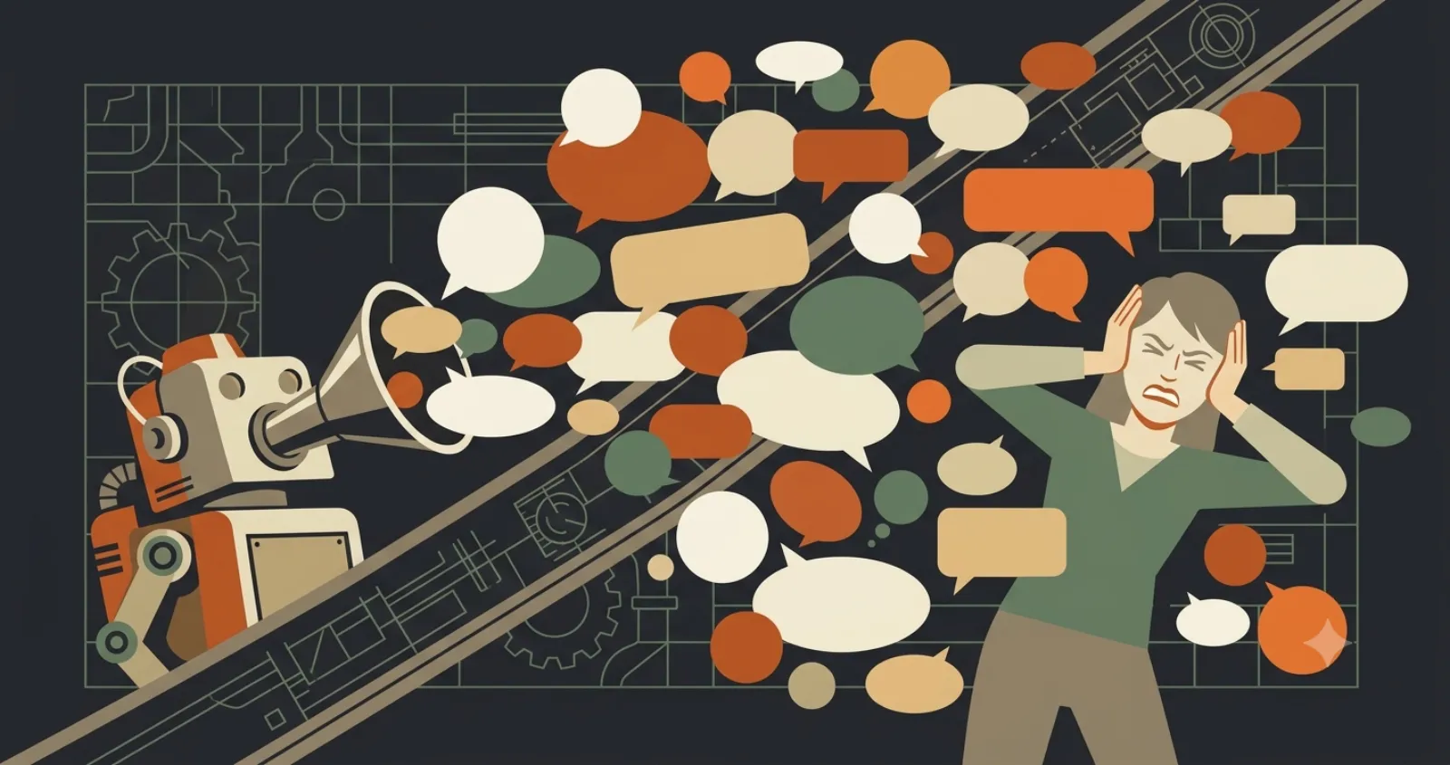
There's a classic web-design book called Don't Make Me Think, and the title is the whole lesson. Every time a visitor has to stop and figure something out, where to click, what you do, how to reach you, you've added friction. A little friction is invisible. Enough of it, and people leave without ever knowing why they wanted to.
The losses are silent, which is what makes them dangerous. Nobody emails to say "your phone number was hard to find, so I called someone else." They just call someone else.
Friction is a tax on every visitor
Most small-business sites aren't broken. They're slightly annoying in a dozen small ways, and the annoyance compounds. A visitor won't work to understand you. They'll assume the next business is easier to deal with, because usually it is.
"You don't lose customers to one big mistake. You lose them to ten tiny hesitations you never see."
The usual culprits
Roughly in the order I run into them:
- The phone number is buried. If someone wants to call, make it one tap: in the header, a real tap-to-call link on mobile, never hidden in the footer.
- The headline says nothing. "Welcome to our website" wastes the most valuable line on the page. Say what you do and where, above the fold.
- The page is slow. Every second of load time sheds visitors, usually thanks to a giant hero video or photos nobody compressed.
- The form asks too much. Every extra field is a fresh reason to give up. Ask for the least you need to start a conversation, and nothing more.
- There's no obvious next step. Some pages just end. Tell the visitor exactly what to do, call or book or email, and make the button impossible to miss.
Clarity beats clever
Designers love a novel menu or a surprising layout. Customers don't. They've learned how websites work from thousands of other sites, and every time you defy that pattern to be interesting, you make them think. Boring and obvious wins over clever and confusing, every single time. When two designs would both work, ship the one with fewer parts to puzzle over.
How to find your own friction
You've stared at your site so many times you can't see it anymore, so borrow a stranger's eyes. Hand your phone to someone who's never seen it and give them one job: "Find out whether we do X and how to reach us." Then say nothing. Watch where they pause or scroll back up looking for something. Every hesitation is a fix.
Try this week
Run that five-minute test with two people and write down every spot where they hesitated. Fix the top three, which are almost always the phone number, the headline, and the load time. You won't get a thank-you note. You'll get more calls, and that's the point.