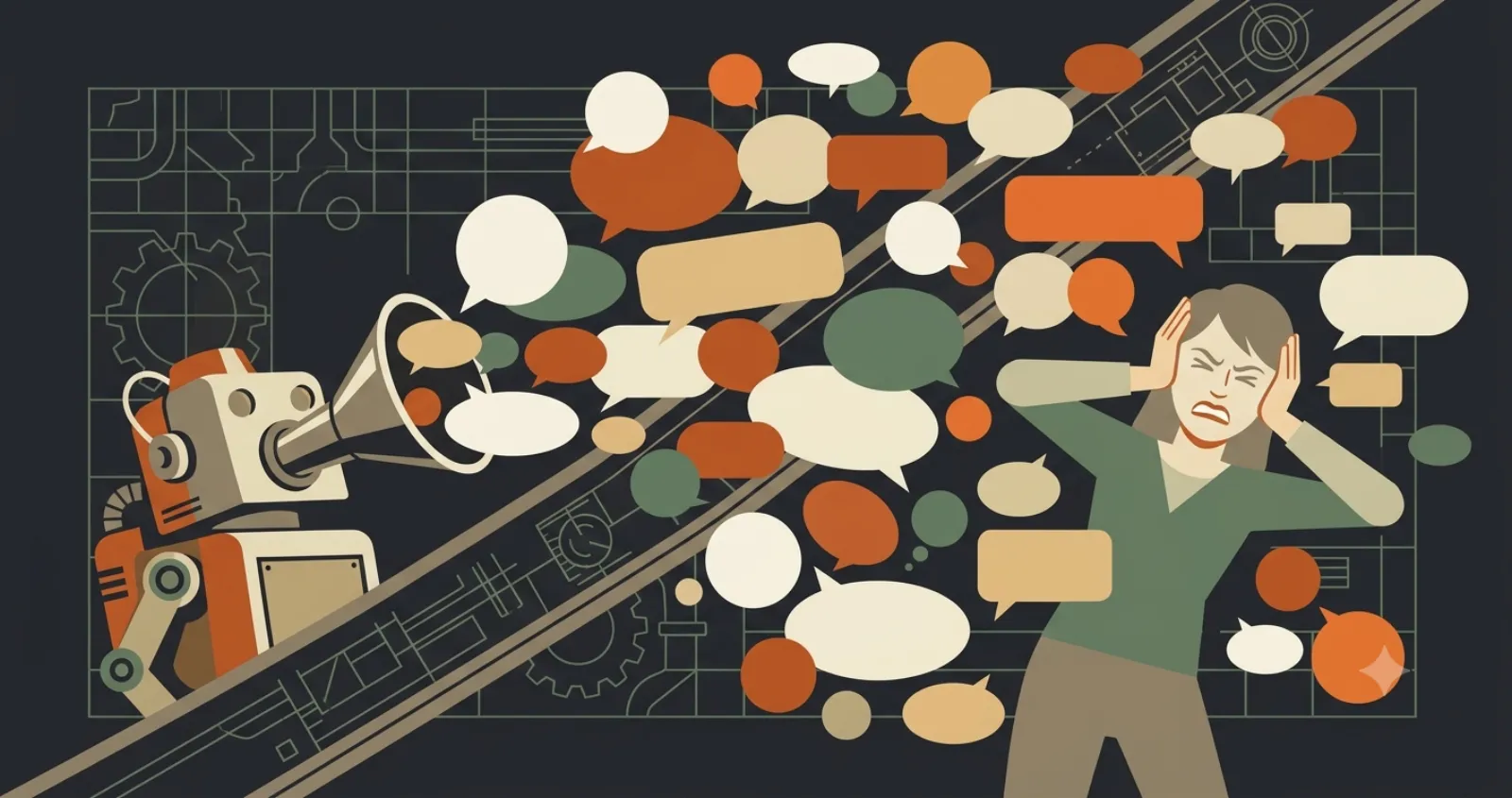
Every few weeks someone asks me to "do their branding," and what they mean is: make a logo. It's an understandable shortcut. The logo is the part of a brand you can point at. But if a new logo were all it took to look established, every business with a nice mark would look established, and you already know they don't.
What a brand actually is
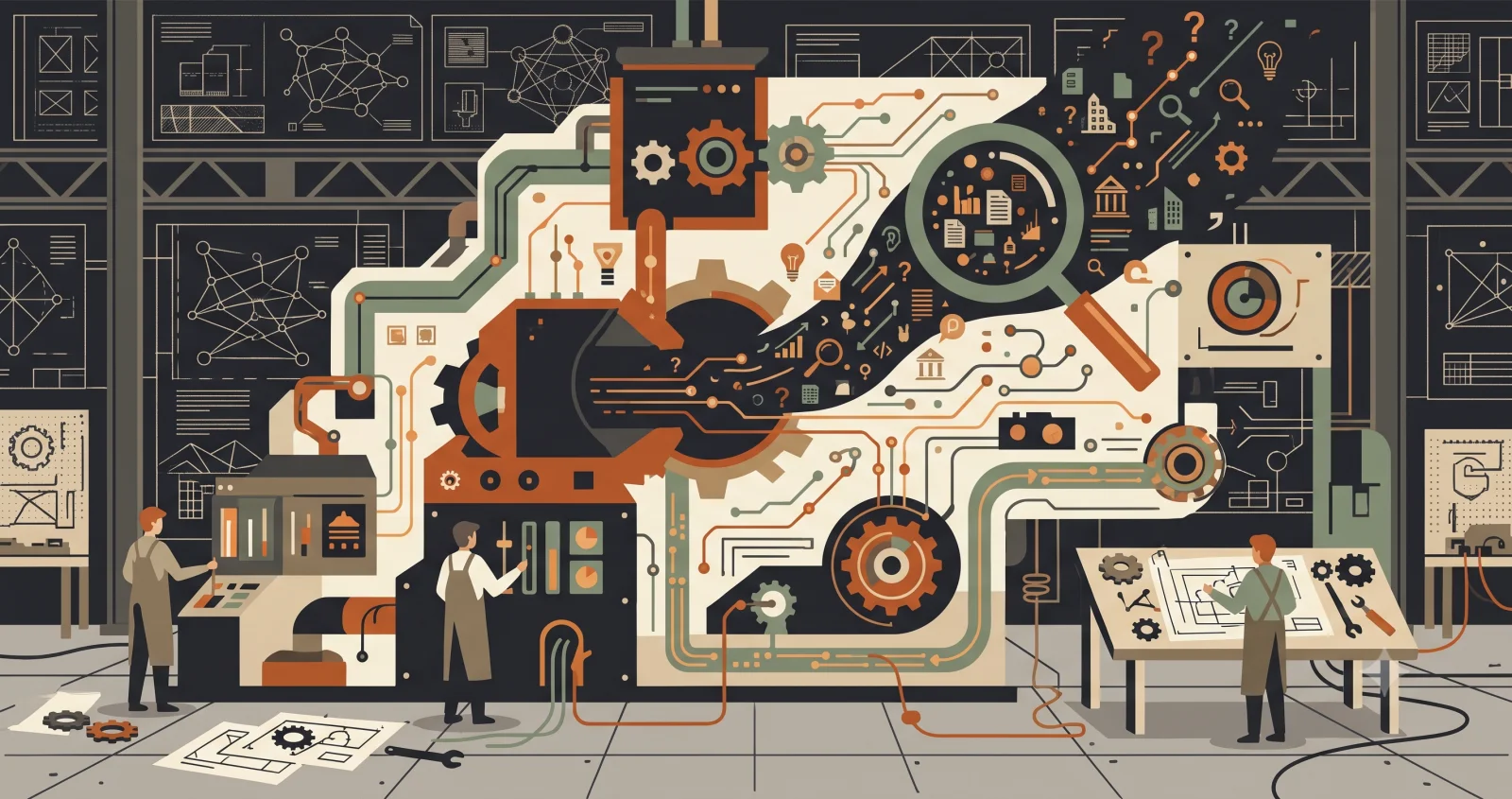
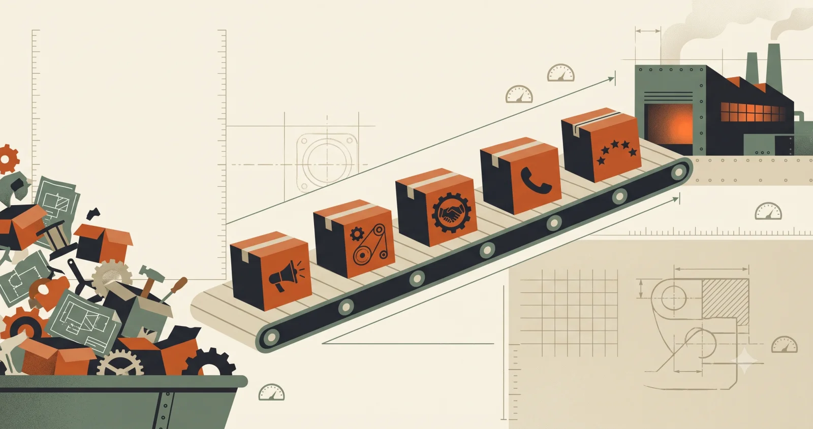
Your brand is the impression a customer is left with after every small run-in with your business: the truck in the driveway, the invoice, the way the phone gets answered, whether the website looks like anyone finished it. A logo sits on top of all that. It can't rescue any of it.
Think of how you size up a contractor. You don't decide they're good because their van has a slick decal. You decide it from the clean work and the quote that showed up when they said it would.
"A logo is a signature. A brand is whether people trust the signature."
The signals that actually read as "established"
None of these are expensive. Most businesses just never get around to them.
The first is consistency. The same colors, the same typeface, your name spelled the same way everywhere it appears. That alone reads as "they've got their act together" more than any single beautiful asset.
The second is finished edges. No stock photo of a handshake, no "Lorem ipsum" hiding in a footer, no link that 404s. Unfinished details quietly tell people you might leave their job unfinished too.
The third is specificity. "We do quality work at a fair price" describes ten thousand businesses. Say what you actually do, for whom, in your town. Specific always sounds more real than polished.
Where the logo does earn its keep
This isn't a case against logos. A clear, simple mark makes you recognizable and keeps you from looking like a hobby. But it's the floor, not the ceiling. Simpler is safer here too: a plain mark you use everywhere beats an elaborate one you keep second-guessing.
Start here
Don't commission a rebrand. Pick your colors and a font or two and write them down. Put the same version of your name and logo on your site, your invoices, and your social profiles. Fix the three unfinished things on your website you already know about. That buys you a stronger brand than a new logo would, and it's mostly free.